

Project

Project

Delta MyFlight

Delta MyFlight

Redesigning Delta’s B2B Experience

Redesigning Delta’s B2B Experience

Redesigning Delta’s B2B Experience

Info

Info

Role

UX and UI Designer

Timeline

January 2026-March 2026

Tools/Lanuguages

Figma

Overview

Overview

Problem

Delta introduced ordering from the seatback screen for first class passengers but didn’t have a system for FAs to receive, manage, or fulfill those orders and no blueprint for what one should look like.

Delta introduced ordering from the seatback screen for first class passengers but didn’t have a system for FAs to receive, manage, or fulfill those orders and no blueprint for what one should look like.

Process

I mapped the full ordering workflow from the FA's perspective through a service design blueprint, running co-design sessions with stakeholders and iterating rapidly through wireframes and mockups until the UI matched the service.

I mapped the full ordering workflow from the FA's perspective through a service design blueprint, running co-design sessions with stakeholders and iterating rapidly through wireframes and mockups until the UI matched the service.

Product

A mobile ordering system within the MyFlight app that gives flight attendants everything they need to receive, evaluate, and fulfill first class orders in real time

A mobile ordering system within the MyFlight app that gives flight attendants everything they need to receive, evaluate, and fulfill first class orders in real time

Intro

Intro

Seatback ordering is a two-sided transaction that Delta is building for the first-class customers. Another team designed the passenger-facing experience, but the need was the flight attendant experience to be built out and work seamlessly with the seatback application. 

Flight attendants have always taken orders in first class, but that's always been a human exchange. This was the first time that interaction was being mediated through a screen on both sides, which meant the design had to feel familiar enough that FAs could trust it, but structured enough to handle everything a conversation naturally absorbs.

Flight attendants have always taken orders in first class, but that's always been a human exchange. This was the first time that interaction was being mediated through a screen on both sides, which meant the design had to feel familiar enough that FAs could trust it, but structured enough to handle everything a conversation naturally absorbs.

Workshop

Workshop

I ran a working session with two stakeholders who were former flight attendants, walking through the types of orders and service scenarios they had encountered in their careers. Going in, the assumption was that ordering would be straightforward: passenger orders, FA receives, FA delivers, but a lot of hidden complexity was uncovered.

The pattern was consistent: visibility over everything else. But here, I had to keep in mind the many changes Flight Attendants would need to make on their phone rather than in person. As the design evolved, making sure every layer of that order surfaced on the card became one of the most important decisions in the whole project.

The pattern was consistent: visibility over everything else. But here, I had to keep in mind the many changes Flight Attendants would need to make on their phone rather than in person. As the design evolved, making sure every layer of that order surfaced on the card became one of the most important decisions in the whole project.

When a FA can see everything at a glance, they can start to think across orders, not just within one. If two passengers ordered something similar, an FA could batch those together and fulfill them in one trip. That was the kind of efficiency that solved specific Flight Attendants challenges by giving them the full picture at all times.

Designing from Assumptions

Designing from Assumptions

I ran a working session with two stakeholders who were former flight attendants, walking through the types of orders and service scenarios they had encountered in their careers. Going in, the assumption was that ordering would be straightforward: passenger orders, FA receives, FA delivers, but a lot of hidden complexity was uncovered.

Part of this journey is discovering the FA experience from happy path to edge case:

  • What does the FA need to see before they commit to an order?

  • What happens when they can only fulfill part of it?

  • How do multiple FAs coordinate without stepping on each other?

To navigate the ambiguity of the problem and work with an external system that was still in design & development, I built a service blueprint that mapped both sides of the transaction, defined where the passenger experience ended and the FA experience began, and locked in the requirements for every screen that followed.

When a FA can see everything at a glance, they can start to think across orders, not just within one. If two passengers ordered something similar, an FA could batch those together and fulfill them in one trip. That was the kind of efficiency that solved specific Flight Attendants challenges by giving them the full picture at all times.

Final Dashboard Modular Header

Final Dashboard Modular Header

Feature #2: A Closer Look at the AI Component

Feature #2: A Closer Look at the AI Component

Visual Cues through aesthetics

Visual Cues through aesthetics

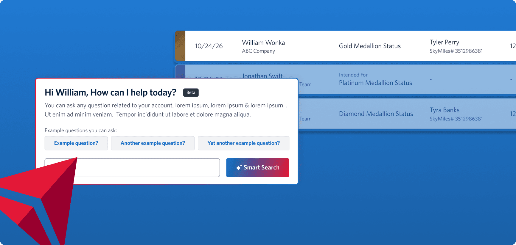
AI is introduced in the dashboard as a beta feature, allowing users to quickly find key data without needing to dig through views. For MVP 1, the scope of the search components is limited to just reporting questions, which means the design had to keep expectations clear but open the door for future capabilities.

AI is introduced in the dashboard as a beta feature, allowing users to quickly find key data without needing to dig through views. For MVP 1, the scope of the search components is limited to just reporting questions, which means the design had to keep expectations clear but open the door for future capabilities.

Iterations that didn't work

Iterations that didn't work

❌ Lacks guidance on AI scope results in little transparency

❌ Limited context and visibility with search result in dropdown

❌ Color palette lacks distinctiveness to signal AI identity and evoke excitement while maintaining visual harmony

❌ Poor hierarchy fails visual hierarchy and information architecture best practices

Final AI Component and Why it Works

Final AI Component and Why it Works

The new design improves scannability and context with a dedicated results view, guided by progressive disclosure principles. Visual hierarchy and distinct AI branding create recognition and excitement, while transparent messaging builds trust and sets expectations for better engagement.

Final AI Component and Why it Works

Feature #3: Services Table

Feature #3: Services Table

Scalable Tables for Data-Rich Features

Scalable Tables for Data-Rich Features

I worked on product pages with dense data tables that surfaced key information at a glance while enabling users to act, filter, and explore. In the services flow, I refined the layout and interaction model by introducing sorting headers, expandable rows, search, and filtering to organize unused amenities and history.

I worked on product pages with dense data tables that surfaced key information at a glance while enabling users to act, filter, and explore. In the services flow, I refined the layout and interaction model by introducing sorting headers, expandable rows, search, and filtering to organize unused amenities and history.

Intentional spacing & filtering Balances readability with compactness, supports large datasets.

Clear information grouping Separates identifiers from travel details for easy scanning.

Clear information grouping Separates identifiers from travel details for easy scanning.

Visual markers Icons provide quick, at-a-glance recognition.

Visual markers Icons provide quick, at-a-glance recognition.

Nested transaction history Pills and grouping make complex data easy to interpret.

Nested transaction history Pills and grouping make complex data easy to interpret.

Final Services Table

Final Services Table

The final services table design balances clarity and usability through intentional information grouping, clear visual hierarchy, and thoughtful spacing. Key identifiers are separated from travel details for easier scanning, while filters and visual markers like icons support quick navigation. Transaction history is streamlined with pills and grouped totals, making complex data easy to interpret at a glance.

The final services table design balances clarity and usability through intentional information grouping, clear visual hierarchy, and thoughtful spacing. Key identifiers are separated from travel details for easier scanning, while filters and visual markers like icons support quick navigation. Transaction history is streamlined with pills and grouped totals, making complex data easy to interpret at a glance.

Takeaways

Takeaways

Intentional Design for Scalable Products

Intentional Design for Scalable Products

By approaching Delta’s operations tools with a focus on intentional, user-centered design, I ensured that each solution was not only functional for immediate needs but also adaptable for future growth. My contributions helped streamline workflows, reduce user friction, and create a cohesive visual and interaction framework that could scale across the organization’s evolving product ecosystem.

By approaching Delta’s operations tools with a focus on intentional, user-centered design, I ensured that each solution was not only functional for immediate needs but also adaptable for future growth. My contributions helped streamline workflows, reduce user friction, and create a cohesive visual and interaction framework that could scale across the organization’s evolving product ecosystem.

Want to see more?